Calming the Chaos:
Designing for Real-World Moments

Project Summary:
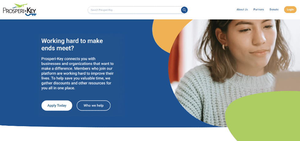
In a three week sprint, our team redesigned sections of the United Way Prosperi-Key website to help users gain a clearer understanding to trust, and to feel confident filling and submitting the membership application. The changes were aimed at reducing onboarding bounce rate, and increasing new user membership to meet the business goals. Initial usability testing revealed improved user confidence, and understanding.
The Problem:
Through user interviews and session observations, I noticed users were struggling with completing the online application. Users were trying to multi-task while filling out the form, when the distractions were too much, often the users would close and bounce out of the membership application. When the user had a moment to return to the application, they were frustrated to learn that the data entered earlier had not been saved, causing them to abandon the process and not enroll.
My Role & Team:
As a UX Designer:
- I identified the opportunity to add a pause/resume button to accommodate life interruptions, helping more users finish the application form, and supporting the stakeholder goal of increasing new memberships.
- I co-redesigned the mid-fi and hi-fi membership application pages to reduce abandonment of the application process by introducing clear value propositions, transparent steps, and breadcrumb indicators so users felt informed and in control throughout the form.
- I participated in stakeholder meetings discussing the goals of the project, expectations of the team, and acquiring the necessary resources to carry out the research and usability testing artifacts.
Team Members:
- Simon Burdeaux
- Sandra Hamlin (myself)
- Kelly Kuykendall
- Courtney Lyons Lopez
- Elizabeth Shin
Process:
Collectively, we followed a user-centered process:
- Research: Conducted 5 user-interviews, and administered a behavior survey to understand users perceptions, frustrations, and barriers
- Define: Synthesized findings into three major insights
- Ideate: Explored multiple concepts to address the issues
- Prototype: Built interactive flow in Figma
- Test: Ran usability testing sessions to refine the design
Key UX Decisions:
Based on the research and insights
- Hero banner content was edited on the landing page to clear confusion and create user trust.
- Designed a "Verify Eligibility" flow ahead of account creation to help users quickly learn if they qualify for membership, minimizing wasted effort and frustration should they fill out the form only to learn at the end that they did not qualify.
- Split up the "About Me" sections to reduce cognitive load, and increase perceived value by informing users who Prosperi-Key helps and the people who run Prosperi-Key.
- During the second iteration, Pause/Resume button was propsed to address sudden distractions, allowing users to continue filling out the form at a later time, increasing the rate of new member sign-ups.

Final Design:
The final design included:
- A “Verify Eligibility” flow that helped users learn if they qualified for membership or not.
- Clearer microcopy that cleared confusion and built user trust and confidence during the application process.
- A “Continue” button enabling users to save their progress, and resume the application at their convenience.
Compared to the site before changes were implemented, this new proposed design gave users the information they needed to move forward with checking their eligibility and signing up for membership.
Results & Impact:
Initial Post-prototype usability test:
The Users:
- Users felt more confident with the “Verify Eligibility” feature, knowing they qualify before investing time with the onboarding application process.
- The new, more transparent landing page copy boosted users’ recognition of the product’s value by 25%.
The Stakeholders:
- Stakeholders expressed a preference for users to go through the Argyle income verification flow rather than use the self-reporting flow.
- Stakeholders appreciated that our findings substantiated their early assumptions about the primary drivers of the increased bounce rate.
We refined the prototype to address issues identified in the first usability testing, but due to project constraints, were unable to conduct a follow-up test to validate the new changes.
Initial Post-prototype usability test, 2nd iteration:
The Users:
- Streamlined on-screen copy throughout onboarding to minimize cognitive load and align with user preferences observed in the initial post-prototype usability testing.
- Introduced clickable breadcrumb navigation to support user orientation and provide a clear sense of progress through the multi-step onboarding flow.
- Added a “Continue” control enabling users to save their progress and return later, accommodating life interruptions and reducing drop-off risk
- Implemented an explicit exit option from the Argyle income verification step, giving users more control and flexibility within the onboarding experience.
Reflection:
- Realized that investing more time in upfront research—especially observing users in their environment—could have revealed the need for a continue feature earlier, avoiding last-minute adjustments.
- Recognized tight timelines prevented a second usability round to fully de-risk solutions.
- Next time, would advocate for deeper contextual research and additional testing cycles pre-handoff to better align with user mental models and minimize friction.
